Monday, November 30, 2015

Prepping for A Specific "Titled" Show

A Few times a year, I receive invitations on entering specific shows that have specific themes. For instance, in the past I have had show invites for the following themes, "In and Out", "Secrets", "Love", and the latest being "On the edge".

Being primarily a landscape plein aire painter, many of my works, I feel do not lend themselves to a specific category under these labels (although, many fellow artist, do, I believe browse their inventory, and choose what ever may come close.) My solution in each of the cases as listed above, was to treat the theme as a new school/work assignment, and come up with a concept for each of the themes, and paint an original work that fits the assignment.  Enclosed are two past cases of these assignments.

While battling for an ideas for In and Out (and I did one solution with In and Out Burgers)
Our two cats posed for "In and Out"
and the real idea hit me as I was letting the cats out one morning, while one came in and the other departed, viola... there was my concept.

Another was love, and again, my first idea really did not materialize as I wished so I landed up wiping the painting off. That night, three days before the entry was due, I thought of an old hippie love bus.  I proceeded to research images (thank you google) where I used different photo concepts and ideas to create my entry "love Bus" which using the previous canvas, I painted in about 24 hours and literally delivered for entry while still wet!
"Love Bus"


Today, will go in to further detail about the latest submission for a show called "On the Edge."

First, its coming up with the concept. Many may think of is on the edge of a cliff, a building. Maybe represent a stress level, or some kind of sharpe instrument/tool etc. etc. Just for fun, I accessed Google once again, to see how images of on the edge there were, and a number came up, with the person at height the most popular. Battling this idea out, I still came up with the idea of a person on the edge of some kind structure, but, hopefully my representation  would be reviewed in a unique perspective.

A number of  pencil drawings finally netted, an overhead view of someone on the edge of a pool.
First concept, photographic reference
Since I was doing a model shot for another concept. I had our young model sit by the pool and I took various posed photos from a step ladder. I then proceeded to do a rough painting of the concept and blocked it off for composition. It was okay, I liked it but felt it was just not quite there.

First draft, by the pool
The next day while riding my bike, I went over the bridge at the Gulph river in Cohasset, and a number of kids were jumping off the edge into the water below. I said to myself, that's it. That night, a new concept was developed from that idea. Now, with the new rough in hand, I was satisfied.  Next Step, proceed to a 18 x 24" canvas of the concept.

Another concept,. another draft
Of course one of the things that worked about the rough was the spontaneity of the color and art, I needed to capture the same essence which I proceeded to do.  While working on the final, I painted in two or three kids waiting to jump into the water below as well. As I progressed I edited out two, and only left the one young girl sitting on the edge. As the painting developed, I liked the idea even more, cause not only was she on the edge, but, what was she going to do... contemplate the water, why is she dressed if she is going into the water.. jump?

After revising the water and rocks a few times, to finally meet my satisfaction, I signed the painting on the horizontal and was ready to submit. While photographing it, I stored it on the vertical, and looking at it, I liked it even better, it lent a vertigo to the scene. So, I covered up my signature, and replaced it so that the art would be viewed as a vertical, and the submission was entered.
Although painted as a horizontal as the above draft,
The final piece was rotated 90 degrees clockwise.
What solution do you think works best?

I was pleased...but like all juried shows, I am sorry to admit this particular entry was not accepted. (although, one entry that was accepted had kids jumping off a bridge, yet, just a straight on view Ho hum...)  Unfortunately that is how it resolves sometime, but all in all I was happy with the picture, (now stored in the corner with many more) and actually still look forward to my next assignment.  It provides a unique challenge other than just relabeling an existing painting.

Will keep you posted.

Sunday, October 6, 2013

Creating a swimming Pool/Fountain Mural


Interesting, I was approached to do a mural for an outdoor fountain...  At first, I was a little resistant on taking on such an endeavor, but, the more I thought of it, I really wanted to accept the challenge, and of course the financial rewards of such an endeavor are always favorable..(hey, a commission is a commission!)

The project was completed, the client is very excited, and I'm pleased with the results. So I thought I would share with you on how it was done.

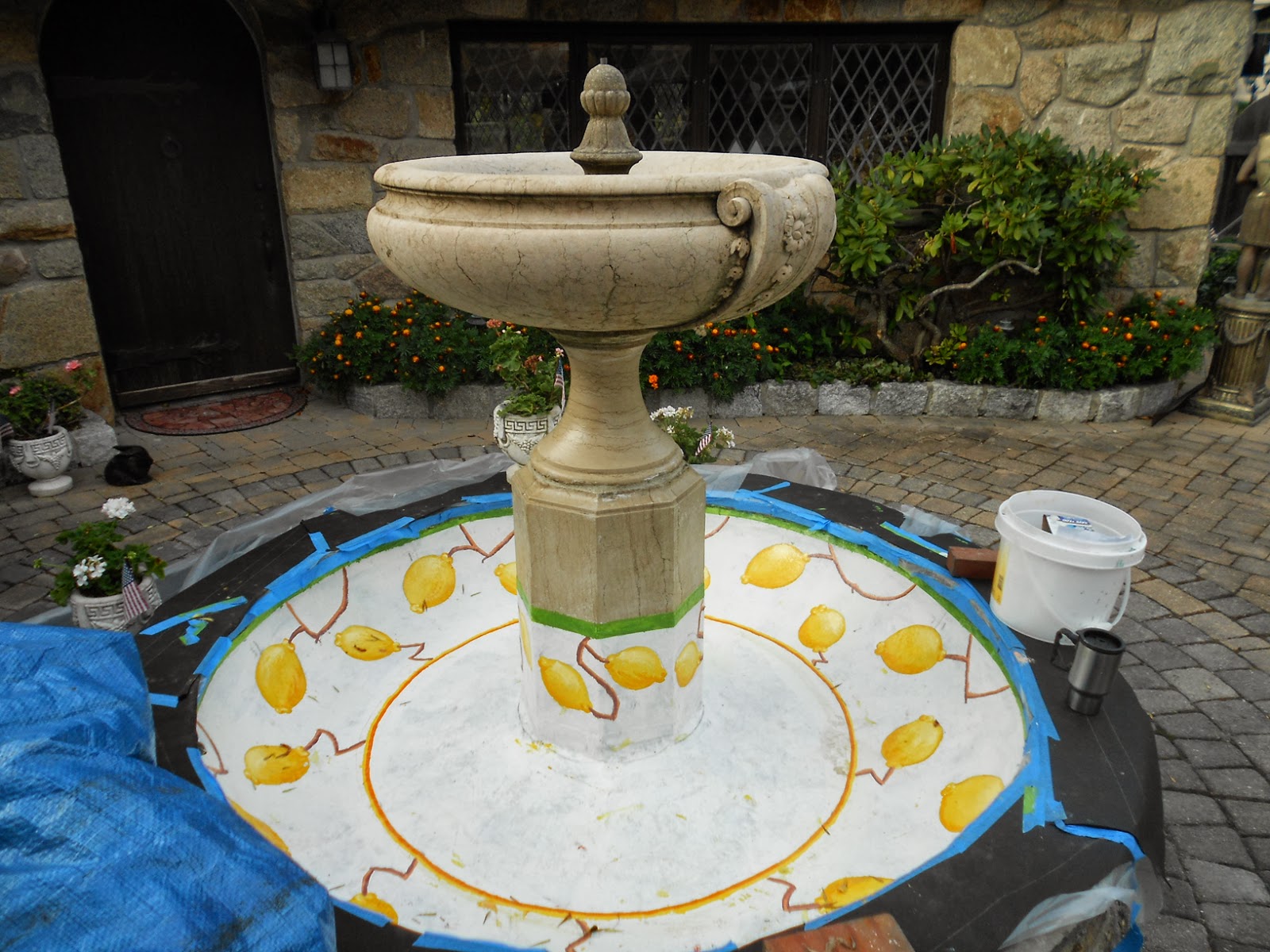
Firstly, the client wished to duplicate an outdoor marble picnic table top (Fig. A) that they had purchased in Italy.  Comps were submitted on how the art would look within the base on the fountain were submittd and amended by the client till a desired result was settled.
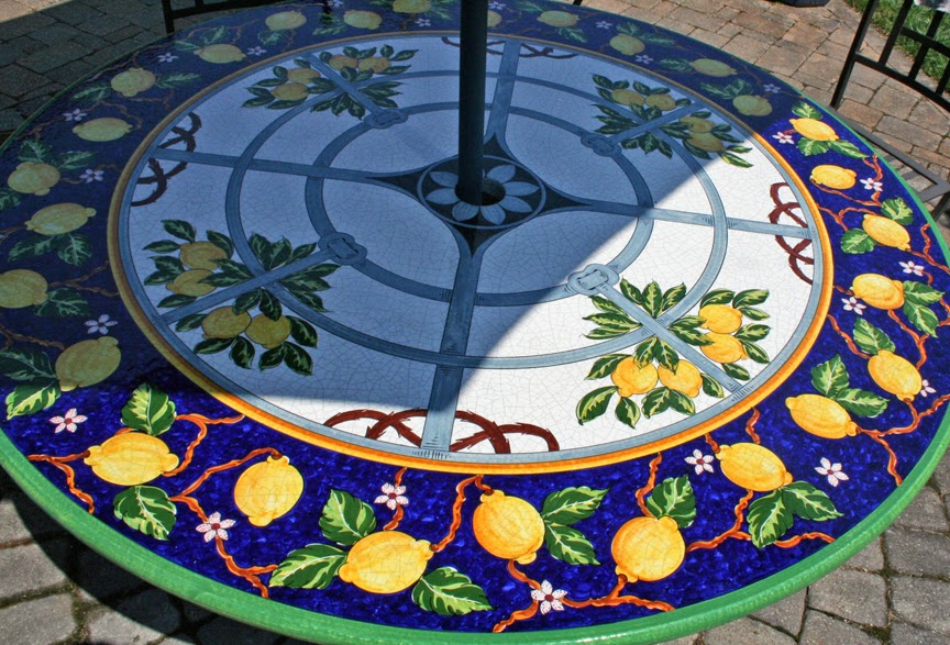
A. The Original table to base the design.

My first burning question, was what kind of paint to use. Since this was being used under water, I was apprehensive about any kind oil/acrylic normal household product.  I was thinking of an automotive finish as well.  But ultimately, why not use a swimming pool paint.  Afterall, thats always under water.  A quick research on the internet, found an number of suppliers available... but 98% offered only shades of blue, aquamarine,
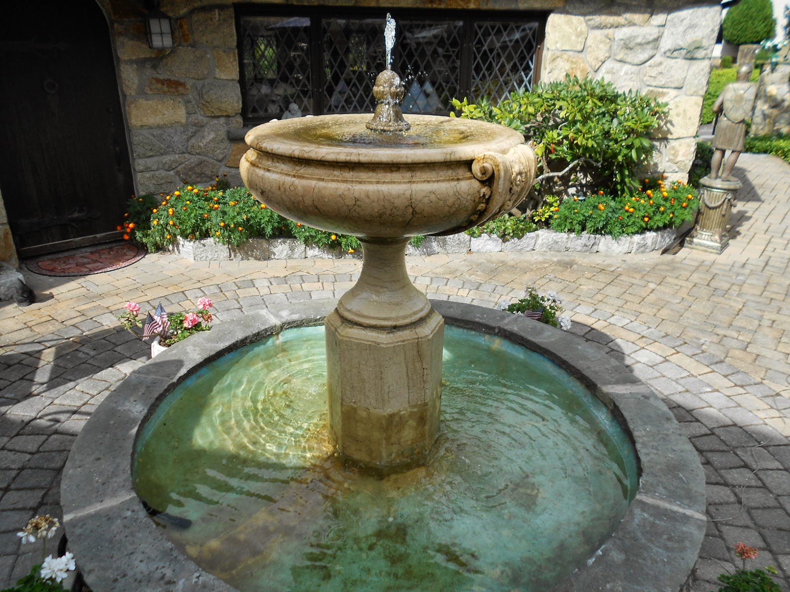
B. The fountain, note the
"roughness" of the base to be painted.
white and black. That certainly would not do.

Finally, I stumbled on a company called 
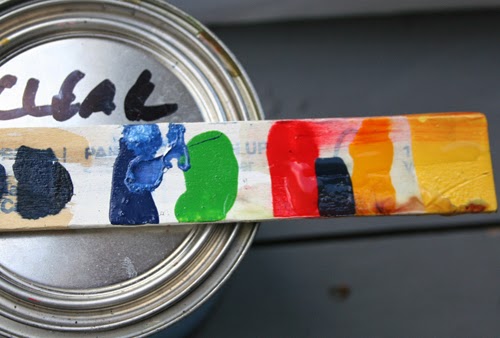
Top Secret coatings, and sure enough, they had swimming pool paint, with a color chart of over 100 samples.  Reviewing my color comp and the original, I settled on a dark blue, yellow, orange, red, green, white and a primer.. plus cleaning agents, and thinner. This way I had the basic colors to create my palette.  I picked up a bunch of small zip lock tubs with locking lids, so that I could mix my paints, then still have some down the line, if I needed more.

Production begins..
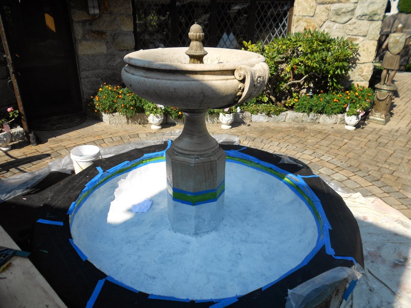
C. Masked off, washed and primed, with
green rim masked and painted.


The fountain base of course was drained and let to dry.. It had recently been repaired, so that a whole new layer of fiberglass was adhered over the old concrete base. (Fig.B)  Problem, was that it was rough...can't do anything about it, just work with it.  The base firstly was cleaned throughly with the agent supplied, dried then lightly sanded.  Knowing that the paint was semi-transparent, the discolored surface was primed to give a good white base, and the proper adhesion for the paint. (Fig. C)

The first painting/drawing steps was to create the green rim around the brim... that was easy, just measure down for thetop, and mask it off, and paint. From there it gets more complicated.
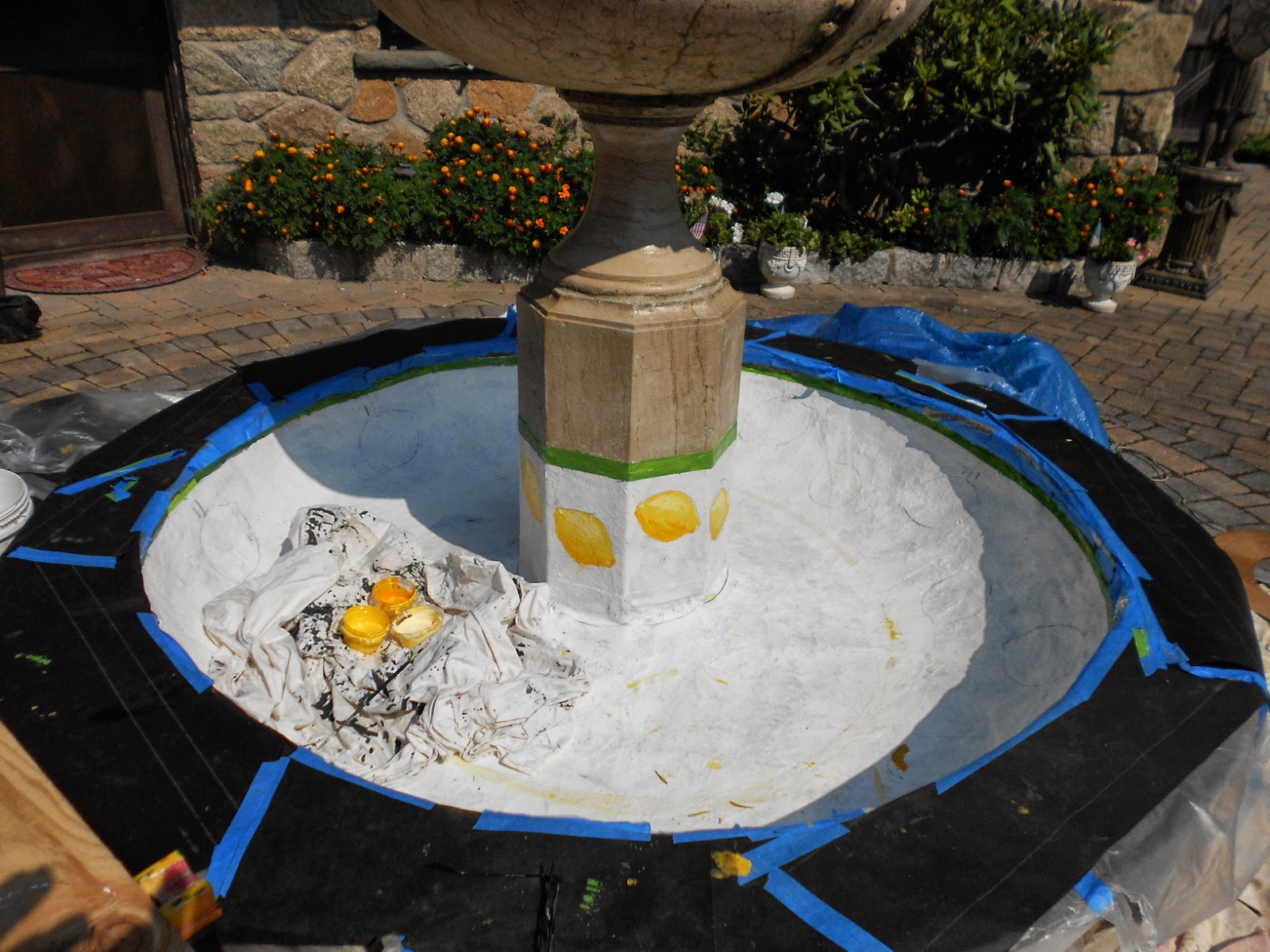
D. The first set of lemons were drawn and
evenly spaced and painted.

The large lemons needed to be evenly space, so it was back to 7th grade math, and figure out the circumference of the fountain, then evenly space the locations, by making a die, an tracing it onto the base.. (Fig. D) and proceed to too paint each. (Fig. E, F) Knowing the consistency of the paint as well, I knew, that I had to start with lights, and work into my darks.. there was no way the light paint would cover a dark, so all detail had to be painted first.

You'll notice, that there is a circle around the base. At first I figured this out by measuring a certain amount down the top  "Lid" and swung my circle. After painting it.. I knew it was wrong, too much inconsistency ( stepping back and eyeballing it, it was definitely a little too egg-shaped..)  It was time to prime that over and rethink the circle out. Since I couldn't access the centerpoint of the circle (the fountain was in the way) how can I get a clean circle...I had one of those aha! moments, and created a collar. Grabbing a larg cardboard panel from the garage ( I can't throw away large carboard panels, way too many uses for them...especially for my mga that always likes to leave its mark on the floor after being driver more than two miles...)
E. The lemons completed
First , I drew an 18" (the fountain is a bit less than 18" diameter) circle on a sheet of cardboard with a compass, then a 24 inch circle around that and cut it out of the cardboard.  (Fig. I.) In essence I created a collar that popped around the center of the fountain, and was abled take all further measurements of that collar.  Worked out fine.

Further stencils were made for the interior lemons and leaves, (Fig. G) and they were evenly spaced around the fountain as well.
F. ...and the leaves and first circle
applied
They too, were hand painted before the background layer... So I now had all my detail work done, it was time to do the dark blue. (Fig I.) this was a simple "coloring" job, carefully painting around all the detail.. A semi transparent look was maintained to follow the lead of the picnic table.

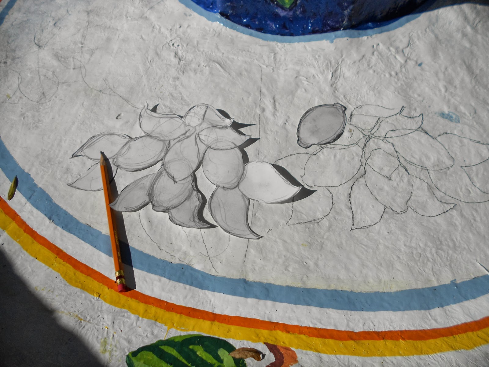
G. Stencil for inside leaves and lemons.
Next plans were to let the paint stand for about three days and seal coat it. A real problem came at this time.  Although the manufacturer said that the paint did not need seal coating, I requested it and ordered a quart of their seal coating.  It did NOT work. It promptly bled the original artwork. Fortunately, I only
H. Even after two weeks of drying, the
clear coat "bled" the paint...
possibly a light spraying
or misting could have worked,
but brushes definitely not.
did a avery small sample, and was easily able to repair the damaged work..

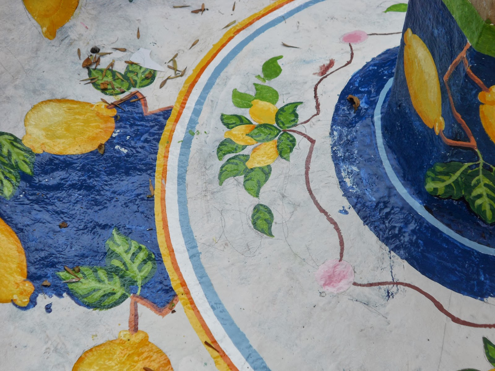
I. All lemons, leaves and graphics are
now done, time to color in the
background
After contacting the manufactured a few times, they literally could not explain the circumstances, other than claim that the paint did not need seal coating in the first place..  The client, in the meantime filled and cleaned the fountain a few times and nicked the art work, therefore, I felt the seal coating was imperative.

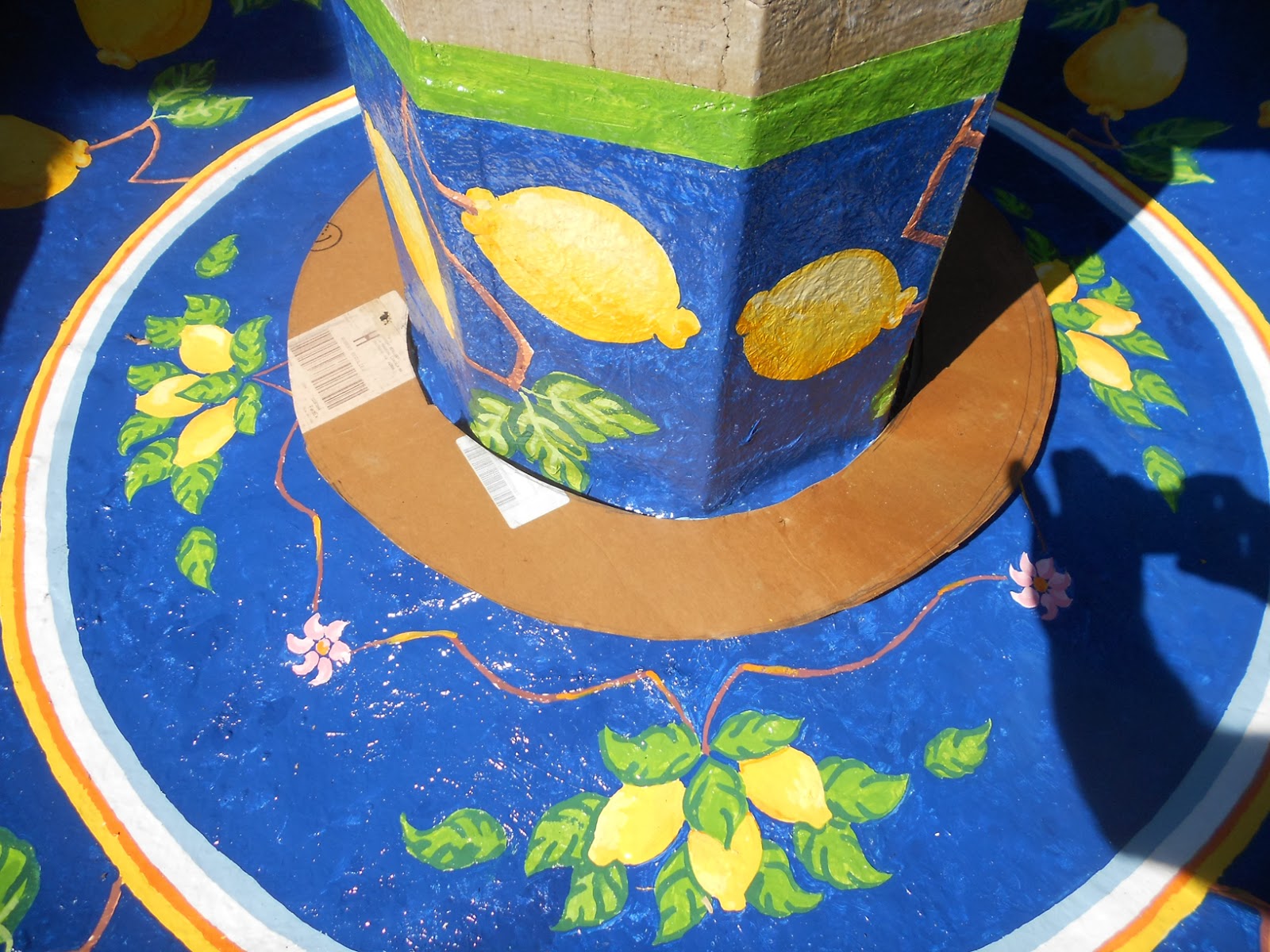
J. This is the collar that was made
to swing the circles within.
We are now two weeks after the completion of the job, thinking the paint needed that time to "Cure" I tried the seal coat once again on some samples I had set up(see fig H) .. same issue.. the paint bled...So much for the seal coating. But I did try a spraying Krylon Crystal clear on the paint, and had no adverse reactions. I called the manufactureere again, and they calimed now issues with crystal clear.

Our final step finally took place with numerous light coats of crystal clear sprayed onto the finished art, with a good 10 minutes drying time in between each coat.  Slowly the coatings built up to a nice glossy varnish- like finish.. I used to use crystal clear on paper comps back in college, and they are still standing well today, over 40 years later.. Figured its gotta be good for the fountain as well.

The job was now complete, and both myself and client are very satisfied.
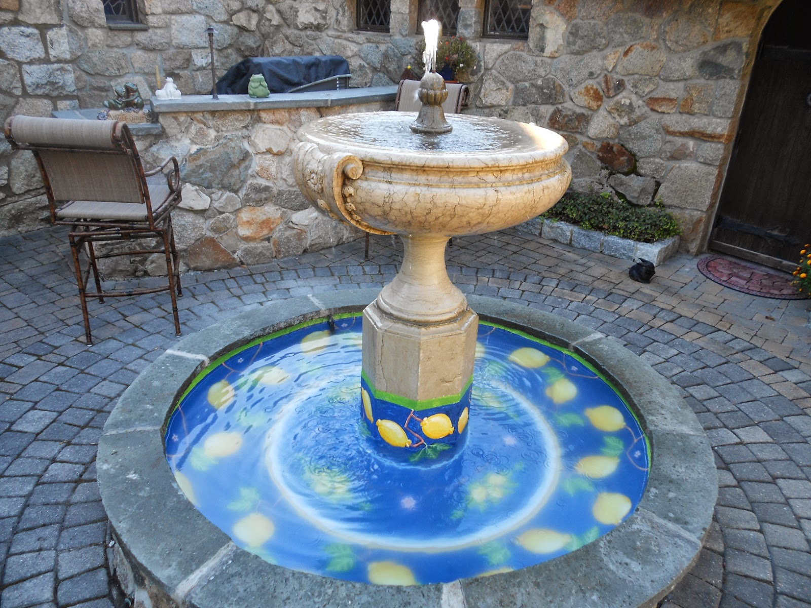
The final product filled and operational!


Wednesday, January 23, 2013

Robert Beaulieu oil Painting for South Street Gallery Open Spaces

During the month of February, The South Street Gallery in Hingham will be hosting paintings by South Shore Artist entitled Open Spaces.  Proceeds for this show will be used to benefit the Massachusetts Audubon Society.

I created an all new piece for this show, that I couldn't resist. Down in Stonington CT, for Thanksgiving at my brothers, I just couldn't resist the afternoon light that fell on his neighbors fields and farms.  The long shadows of late afternoon fall/winter light has always been one of my favorite subjects (see others on mywebsie.)...it makes for great compostion.

Anyhow, what is unique about this, I did the same scene about 12 years ago as shown here.  What's fun is how, as an artist, you are always developing, changing and sometimes maybe even improving(???).  I do like my newer direction, looser, by so much more colorful ( Paire school of Art always had us using brunt and raw umbers... I barely touch those now). Yet, interesting, there are still a basic core that I like about the first painting as well.  Of course, you can see how I use the the long highlight of the afternoon sun off in the fields, just the same as the newer one, and for instance this winter scene down the street from our home.

Eric Sloane, noted artist or rural landscapes, used this technique quite often, so I need to give credit where credit is due. Hope you enjoy thanks for taking a peek.


Daves Farm, Thanksgiving 2012, by Robert Beaulieu

During the month of February, The South Street Gallery in Hingham will be hosting paintings by South Shore Artist entitled Open Spaces.  Proceeds for this show will be used to benefit the Massachusetts Audubon Society.

Daves Farm, By Robert Beaulieu, 1994(?)
I created an all new piece for this show, that I couldn't resist. Down in Stonington CT, for Thanksgiving at my brothers, I just couldn't resist the afternoon light that fell on his neighbors fields and farms. The long shadows of late afternoon fall/winter light has always been one of my favorite subjects (see others on my website.)...it makes for great compostion.


Bound Brook, 2004(?)
by Robert Beaulieu
Anyhow, what is unique about this, I did the same scene about 12 years ago as shown here.  What's fun is how, as an artist, you are always developing, changing and sometimes maybe even improving(???).  I do like my newer direction, a bit looser, and so much more colorful ( Paire school of Art always had us using brunt and raw umbers, have gone to blues and purples for shadows... I barely touch the umbers now). Yet, interesting, there is  still a basic core that I like about the first painting as well.  Of course, you can see how I use the the long highlight of the afternoon sun off in the fields, just the same as the newer one, and for instance this winter scene down the street from our home.

Eric Sloane, noted artist or rural landscapes, used this technique quite often to make his paintings really zing, so I need to give credit where credit is due. Hope you enjoy thanks for taking a peek.


Saturday, December 15, 2012

North River Sunset By Robert Beaulieu

Years ago, being as all typical folk singers, Jone Mitchell had the usual long rap between songs (Joni, just sing will ya!) Any how, she was talking about musicians against artist. She discussed the musician has the opportunity to perform the same work over and over. Whereas, the Artist, only performs once. "Hey Van Gough, paint me a "Starry Night" again!" (Then again Joni, don't you get sick of singing " the BigYellow Taxi....)

How does this relate, well as artist we do occasionally do the same paintings over (ask Monet).  This past week, I was inquired about purchasing one of my paintings as displayed on my web site.  Unfortunately, it had already been sold.... the client really liked that version (although I had two other North River paintings )   Hey no, problem, I'll just paint it again.

So Viola, another edition of North River Sunset, and believe it or not, it gets better every time..

enjoy.

Monday, December 10, 2012

Robert Beaulieu Plein Aire Painting, Cohasset Commoon

Last time we reviewed a step-by-step, we were in a studio, doing a figure.

A few Weeks back, I created a few new 9 x12 paintings for the South Shore Art Centers small works show. One of them was of the Cohasset Common, on a beautiful crisp fall afternoon. Using my trusty camera phone, I recorded a few stages along the construction of the painting....

Lets begin....


Interesting, but sometimes one of the most time consuming aspects of the painting, is to ensure the correct location. Although, I knew I wanted to do the common, but just where, to have the best composition.  Walking around with my easel and paint kit, i viewed different sites using a viewer.  This can be a rectangle cut out from cardboard (approx. the same shape as your canvas) and "sight" your composition through this "frame"  A number of times, I have set up, even started, and find myself maybe moving a few feet in one direction or another to gain the optimum view!  As you can see in the photo, a number of vehicles blocked our view of the church. Fortunately, they did not obliterate the scene, and could be easily omitted, and still know whats going on with the view.

Anyhow, now that we are comfortable with the site and composition, like the figure study as before. I cover the entire canvas with a light earth tone wash.  A few strokes indicate the composition and major elements within the composition.  I may take my towel, and also wipe out few of the highlights. Basically, I am making a simple monochromatic study.

I next scumble in color to see where the balance of the trees are, the grass and the sky,  This gives me a good relationship of value and color balance.  My tonal balance may be ore in a middle ground. Already, we're starting to establish the feel of the artwork.

Our major players of the composition are now established.  in essence, its now a building program of adding detail upon detail. the trunks and branches of the tree are starting to be assembled.  Note, that a number of the branches are dark while in the shade, and the other are a warmer lighter tone, as the light seeps through the branches.  This really make the tree have some volume and dimension.  In this particular scene, a farmers market was being held, so I started incoporating small bits of color to describe one of the tables in the middle ground. Having a few figures in the scene, is a great way to "Humanize" the scene, as well as establish an excellent size relationship.  I have also established he strong contrast of the stepple against the sky.

Okay, we're continuing the detailing... a couple of little tricks.  Although the windows in the church were 16 over, 16, at the distance we're painting, they really fade out, so , just a dark square was used to show placement of the windows ( a flat tip brush, and a short dab is all it takes.)  Since the church itself was bathed in a very warm late afternoon sunshine, I use a white, with just a touch of yellow within.  notice that I "outline" the windows with a horizontal, and vertical brush stroke.  This cleans u the edges of the dark window, and also kind of establish the casement of the window. I'm also starting to build out the farmers table, by not looking at total detail, but color and value shapes. Trees are taking shape now by establish the dark and light shapes (our first steps with the tree, we scumbled in more of a middle ground)  I call this "pushing and pulling," to establish the dimension and light source falling on the tree.  The foreground grass is really bathed in light, and use strong vertical yellow graeen to make it Pop.

Almost done, I establish cooler shadow patterns on the church and then go back with my strong light and painting the facade of the church. I use a vey slight tonal change in the color, so that it captures the feel of the clapboards.   I use horizontal strokes to paint the facade.. the pattern and stroke of the paint again, enhances the clapboard siding of the structure.   This is where we do our final detailing of the leaves, both on the tree, and the ground as well as the farmers market table and figures.

We are done.  This was all done within a two hour time period.. Sometimes, I do the paintings back  to the studio and nudge/refine the painting.  But, creating an Alla Prima painting right there on location, lends a certain  spontaneity that may be lost in the studio.

This one I was pleased with, and just left it alone.. I hope you can enjoy it as well

Its now hung at the South Shore Art Center's Small work show with a few other small works that I created..

Thank you .... Bob

Wednesday, September 26, 2012

Robert Beaulieu, Painting the figure

After many years of painting figure studies at Scott Ketchum's Monday night workshop, this past monday, I took some shots of my work as it was in progress.
I like to share with you my approach to working with the figure.

Photo One.
Photo One. You can see that I did an overall warm wash with oranges, burnt sienna and a little blue.  I usually always start this way, but may actually use olive greens , or even blues and purples, I kind of do this by the skin tone of the model.. very pale, actually greens work well ( then all over tones are kind of pinkish)... a little outline of the general porportions of the model are created, as well as taking a soft paper towel (Bounty only) and wipping out a few highlights.. you can see form taking shape already. The background was also serves a slight lubricant for further application of paint.


Photo two
Photo Two:  The form is now being further defined by scumbling in some of the background tones and adding a few more highlights (as well as a few shadow areas) and tones to the figure. I'm keeping my tones still in the mid range so that I have an option adding lighter highlights, or accent with darker tones, all to eventually create more form.

photo 3
Photo Three: Its really a building project. More tones are added to the figure.  I may now start concentrating on one part of the body (the head). Hands, heads, etc, I ususally try and do during one sitting between breaks, cause no matter what, the model never seems to get into the perfect duplicate postions (especially hands).  But, I still leave myself the option of painting different parts of the figure, to ensure, I am not getting too misbalanced with this particular point. Also, make sure you walk away form the canvas, step back take a look... and no cheating while on break.. you can touch up background, but no touching the (ahem) model.


photo four
Photo four.  We definitely have some form and rhythm going now, and all is starting to take shape. Its now time to add a little more background in to accentuate the model and softly build up the figure..  With the wash applied in the beginning, (using turpenoid) my canvas is still oilly, ( but not goooey) so that tones can be easily applied, spread and molded. You can still see how the initial wash is still an important part of the overall tone.. Its basically the mid tone color range. Literally in some cases my "pinkey" finger becomes a great smoothing tool ( and thats probably why I have paint all over my Mitsutbishi as well.) As you can see I have also taken this one setting of the model to start detailing out the left hand.  Actually the right hand is out of the picture, (she has her arm extended over the couch) but I have indicated putting the hand back in for balance of the composition.


photo five
Photo five. Although I do the face and hands in one setting, I'm not afraid to go in and detail it a little further (we have really already captured the positioning etc. of each.) More detail is added to the background as well as reflected lights.  note that the skin tones tones will reflect the surrounding light, hence, a bit of green bouncing back into the shadow areas. I asked the model to change her hand so that I could start painting the right hand...other participants in the workshop at that time, have established their studies well enough, that a 10 minute diversion does not bother them. As I build my background, I staart working my greens, and in the shadow area, I go cool, and basically use a purple tone, makes a great contrast.  As a footnote.. I Never use black... I don't even have a tube of black in my paint box. there were two definite wraps the model was sitting, you an se the separation in the previous photo, but as i went further into the detail, I found the separation of the two caused a misbalance in the composition, and it became too much of an eyesore, hence, it was omitted and softened.

Photo six:  Viola, three hours later we are done.  What happened to the hand..
photo six
Well to be honest, it just did not work in the location I had wished, and it just didn't look right, so, easily, I omitted it, and went back to the original pose.  Don't be afraid to make changes along the way, and especially don't try and correct mistakes, they tend ot get worse.. Many times doing these three hour poses, I may find that after the first hour, I wipe my canvas clean and start over.  In Plein Aire, which I will do another time, you always need to be able to edit, omit, add or change.  Anyhow, as you can see many of the finer highlights are added since photo five.  Could I continue to work on the painting longer, yes, but do I want to. No.  I really like the spontaneoty of working for three hours.. If I came back and did another three hours, the following week, i would feel as though the looseness of the study would be lost.

Thank you for viewing and will post plein aire in the near future

bob